See what I did there?
Designing the cover of The Waste was one of the most fun parts of its creation for several reasons. 1) Unlike the book itself, the cover only took a few weeks, as opposed to a fourth of my adult life so far. 2) It was the first time I got to see someone else’s impressions of my work in the form of art, which is terrifically rewarding. 3) It was the first time I got to collaborate with someone else on an element of my book.

My collaborator in question was none other than Hillary Wilson, a landscape artist of incredible skill who I found, quite frankly, while searching for someone who wouldn’t charge me $400 dollars for the commission. You can find Hillary and her portfolio on DeviantArt and Facebook. Hillary was a great sport throughout our chain of emails, making complex or minute adjustment to the art so that it conformed to my (ever-evolving) vision. If there are any flaws in the painting, they are my fault, not hers.
I’d like to talk a bit about the thoughts and meaning that went into the cover art—first the painting itself, then the print and ebook covers that use the painting as their main feature. I’ll be bringing up plot events from The Waste itself, including spoilers from up to chapter seven, so if you’d like to avoid all of that, you can just pretend this article is a shill for Hillary and stop reading here. If I still have your attention, then by all means let’s get started.
As The Waste starts, Cadorus is a young Inavi Prince who revels in how his father and subjects will finally acknowledge his engineering contributions. In chapter one, Cadorus is truly at a high point in his life: the pressure of being overlooked is fading away, he is free of guilt, and he is to be honored by people whose respect he has struggled to earn for all of his life. But Cadorus is willfully suppressing part of his past: four years previously, in the Hyperion Conflict (or more bluntly, the Wasteful War), Cadorus helped develop a weapon of mass destruction called the geon bomb and, perhaps worse, fired it at the town of Oland himself, killing thousands of people. This contribution to the war led to Endura’s defeat and the subjugation and mass-enslavement of its people. Cadorus spend the first few chapters of the book ignoring this act, fixating on the innovations he plans to develop with his talent for engineering.
But an Enduran warrior named Voyevoda assassinates Cadorus, and Cadorus’s allies revive him with geon, the same mystical font of energy that was used to destroy Oland. Voyevoda then kidnaps Cadorus and, in taking him south through Endura, inadvertently shows Cadorus the crater, left by his geon bomb, which is all that remains of Oland. Though Voyevoda only intended to stay for the night at a village near Oland, she ends up following Cadorus up a sand dune (created from sand displaced by the explosion) to overlook the crater, where they talk for hours about the town as it once was and the guilt Cadorus feels in destroying it.
That conversation above the crater becomes the defining moment of Cadorus’s life.
Hillary’s painting captures that scene, from chapters six and seven, in which Cadorus establishes his mindset and goals for the rest of the story. There are a few differences, of course—Cadorus and Voyevoda never started a fire on the dune; the area was mean to be strewn with broken chunks of buildings; the scene took place in the dead of night with the moon in their faces as they spoke; the golden city of Auram would be a dot on the horizon, not the glowing vista that the art makes it out to be. But the cover art is not meant to be a snapshot from the book; it is meant to reflect, from first glance, the thoughts and emotions that went into The Waste.
I directed Hillary to section out the cover art with three focus areas in mind: the “campers”, the “crater”, and the “city”. Originally I wanted the three arranged diagonally, with a clear visual trail leading through them, but Hillary convinced me that it worked better as you see now. I set out with a clear message: the campers look out among two contrasting elements, a beautiful golden city and the crater ruins of a town. Like a wall, the crater separates the characters from Auram so that they cannot ignore the ruins to see the city. And as for Cadorus, he would have grown up to be a proper Prince of Auram if his part in the war, his bombing of Oland, had not affected him so deeply that he dedicated himself to redemption. What separates Cadorus from his family, from his rule and status, from the place where he finds the most joy, is the town and lives he destroyed.
I appreciated Hillary’s use of purple and blue with yellow and orange, contrasting colors that I thought would shape the scene into a somber, soothing sunset. I wanted an attractive painting, after all, and Hillary performed beyond my expectations in that regard. By her hand, a scene of guilt, regret, loss, and remembrance was grown into a view of a land that is beautiful and serene despite the horrors it contains. And that contrast, the interplay between beauty and pain, is why the series is called Beautiful War.
Despite the work I put into designing the ebook and print covers overall, I hold that Hillary’s painting is the best part of both covers and should be the focus of both of them. But let’s talk about the rest anyway. I didn’t go to art school and I’ve never been particularly devoted to visual art like my sister is, but I did my best to put together the covers myself since I was a bit tired of giving people large sums of money. The print cover slash jacket came first.
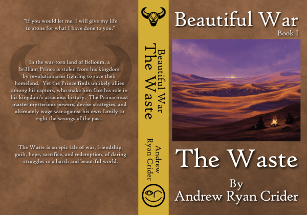
I went with High Tower Text for my typeface, as the font I used for elements of the interior, Matura MT Script Capitals, wasn’t quite readable enough for the book’s title, especially when I had to shrink it for the spine. The background of the jacket is meant to present a sort of leathery feel, although fun fact: I used the same filter for the brown background that I used to give the maps of Belloum and Amirand their parchment-y texture. As for the spine itself, I chose goldenrod for the background because I have always thought of it as the main color of the Inavi, who use golden geon, and Cadorus, who has blond hair. The other books will have a kaleidoscope of colors so that hopefully, when you’ve bought the series twenty years down the line and you have all of them placed in a shelf, the lineup of colors will be attractive and eye-catching at once. And here’s a hint of what’s to come: the next book’s spine will be green. Forest green, Landesti green.
The logo at the top of the spine (and on the back of the book) is the symbol of Rebirth, the organization to which Voyevoda belongs and which Cadorus joins. It depicts a stylized kuja skull but also resembles the geon bomb, and I describe it a bit more thoroughly in chapter four. That logo is also used as a graphic for section breaks in the novel itself. I designed the logo myself and I’m very pleased with how it came out. At the bottom of the spine, on the other hand, sits my personal logo, the ARC face. You can see that logo on my website or in the About the Author section of The Waste. The logo depicts a smiling face, obviously—my smiling face. I don’t wink very often, but my left eye is terrible compared to my right; when I wore glasses as a child, the left lens was twice as thick as the right. But there’s another trick to the logo: the right eye contains an arched A, the winking left eye is an R (lowercase), and the smiling mouth is a rotated C. A-R-C, as in Andrew Ryan Crider. As for whether I’m proud of this logo, well, it doesn’t matter now. It’s on the spine of the book, not to mention on my business cards.
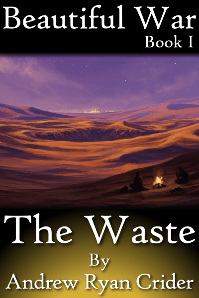
The ebook cover was a much simpler, and quicker, affair. I wanted it to be plain and readable even when the cover was shrunk to thumbnail size. So white text on black I chose, but I added the golden glow because the thing needed more color. That’s the same goldenrod I used on the spine, and the ebook covers for the next few books will probably resemble this one, albeit with different color glows set in different places. You can think of the golden glow as geon beneath the surface of the earth, if you wish.
When I build my book covers going forward, I’m happy that I can draw from the lessons I learned this time around, and if you utterly hate the covers, I hope you can at least take my work as a lesson in what not to do. But I’m pleased with how the covers have come out, and I hope you are, too. Whatever I do differently next time, I’ll be calling on Hillary Wilson’s services again, because she can truly craft a stunning landscape and I love how she turned a scene from my novel into something others could see. I don’t envy people who make movie and comic adaptations from novels—translating text to visuals is a challenging process with a lot of blanks that you need imagination to fill in. But I had a wonderful time working on these covers. There’s something simply magical about transforming a collection of rambling ideas into something you can see and, even better, hold in your hands.
